Ever since bitcoin became a phenomenon way back in 2017 (some may even argue before then), there have been attempts to forecast its price trajectory into the future. The most common way of course was to use linear projection. But there are many other approaches that may get better results, and through our close and long standing analysis and investing in the asset, we provide here a very brief exposition of how price projections can be done for this, and perhaps all fat growing crypto assets.
There are logs, and then there are logs
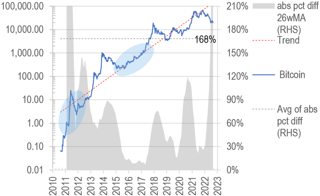
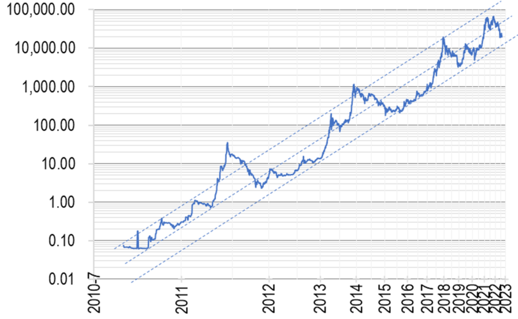
Most excel wizards would be familiar with a handy feature to turn linear charting to logarithmic scale, which may provide much closer fit and easier for interpreting of trends. This is indeed how we started back in 2017 as well, and even now to many, the simple relationship still somewhat holds, despite some large deviations, especially at the early and late ends of the price spectrum:
Chart 1: BTC price trend on linear log scale – not a bad fit
However, as we found out ourselves over time, that simple tool became increasingly frustrating when the price of bitcoin began moderating from a linear fashion, this deviation became increasingly obvious after the 2018 bear correction.
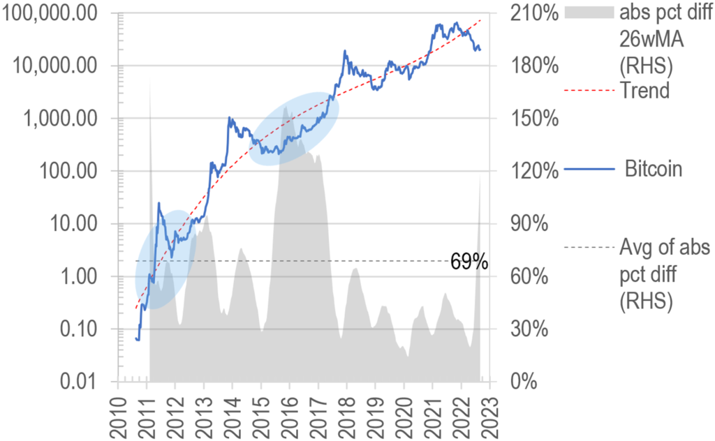
We as a result, resorted to higher order polynomial log fitting to put the relationship back on a sound footing, starting with 3rd order polynomial log correlation. As one can see from the 2010-1 blue shaded areas in Chart 1, the gap was very large, but on 3rd order polynomial fitting, much reduced (see same shade in Chart 2). Further, the 2015-6 shaded area in Chart 1, although quite close to the actual price progression, was actually far from what a decaying trend should be, as seen in the distance between price and the 3rd order polynomial approach below:
Chart 2: BTC price trend on 3rd order polynomial log fitting – somewhat improved correlation
What is more, the average distance overtime between the trend line and actual price is now better at 69% compared to 168% using the linear approach. A pat on the back!
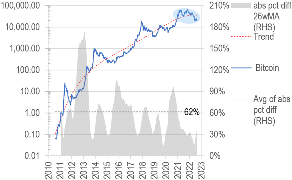
The story does not end here – as progressive price cycles set in – one can now count four cycle peaks and 4 cycle troughs from 2010 to date – the ability of the 3rd order polynomial approach to curve fit disappears. By adding orders of degree to the trend equation, we may play catch up, but that really is too mechanical and ultimately unwieldy, even though the degree of fit did improve (variance reading improved from 69% to 62%), here is 5th order fitting:
Chart 3: BTC price trend on 5rd order polynomial log fitting – better fit still!
The advantage of another degree of freedom to capture turning points is illustrated above by the blue shaded area, where the trend now captures the 2022 downturn which was not identified by the 3rd order trend in Chart 2.
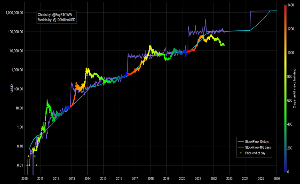
Stock to flow model also has issues
Another approach that is well known out there is called the ‘stock-to-flow’ model where the value of bitcoin in circulation over the supply thereof over any set period is used as the basis of curve fitting to its traded price, as shown here:
The validity or otherwise of this approach is not of interest to our discussion here, but there have certainly been very large deviations from actual traded price, as is obvious from the chart above, and often such deviations are sudden and unrelated to market conditions, driven by the halving phenomenon built into bitcoin’s protocol.
As a result of this, we decided to pursue other avenues to better model the price of bitcoin.
Commodity or currency, it is a monetary phenomenon
As all traders / investors might have had a hunch on how crypto price actions increasingly correlate with the wider capital markets, they may also begin to expect overall monetary conditions would have an increasing impact on price action of cryptos, especially now this asset class is valued in the trillions instead of mere billion or million dollars a few years ago.
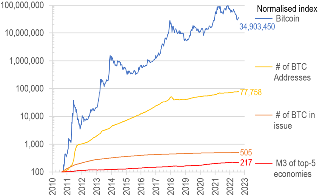
In other words, we should increasingly factor in availability of money as an input variable for any projections of bitcoin prices. The other key variables we deem important in this calculation include also: a) the number of non-zero balance bitcoin addresses, this acts as a proxy for the level of adoption in the population at large, and would be useful in modelling the network effect of rising usage of the asset;
b) number of BTC in issue, which obviously is increasing, but at a ever diminishing rate. In a sense, this metric is a bit like the money supply element of fiat currencies, where more supply debases the value and resulting in higher prices.
As an overall comparison, we put the three factors on the same scale so as to visualise the comparative impact they may have had on the price of Bitcoin in the recent past:
Chart 5: BTC price in the context of demand (# of addresses), supply (# of BTC in issue), and fuel (Global M3)
Obviously, some factors will have stronger influence over Bitcoin price at different phases of the asset’s history, eg the number of addresses featured heavily in the 2010-2 period when the growth was highest, while in the longer run, it may well be money supply which will dictate future price changes, when for example the user and supply growth both taper off.
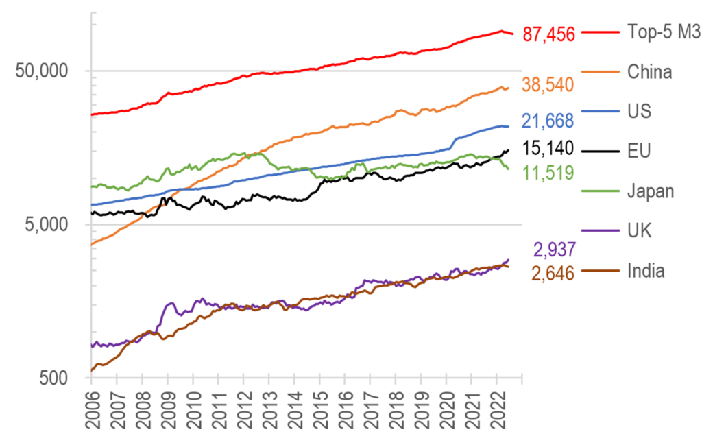
In compiling the monetary facet of the input variables, we picked only the top 5 economies as proxy, but obviously more countries might produce better results. We will for now stay at the more manageable level this stage in our adventure. Here is the composition of the top 5 countries by M3:
Chart 6: top 5 countries by M3 (U$bn)
Perhaps surprisingly for most, China now has a bigger M3 value than the USA, and by quite a large margin, followed predictably by the EU and Japan. UK and India (not included) are much smaller by some distance, as shown in the chart above. Together, the top 5 M3 economies account for 55% of global GDP – may be at some stage we would bump that figure to 67% to increase the accuracy?
The new Grand Unified Theory of BTC?
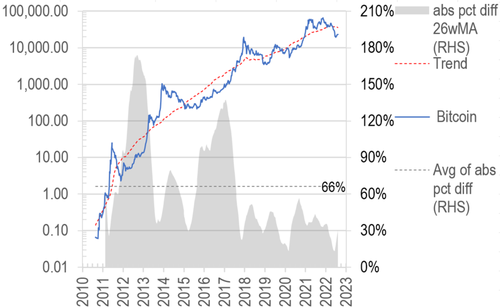
With the above foundations, we are now ready to put all the pieces together – with a regression model curve fitting, we have come up with a new trend line for BTC prices, as shown here:
Chart 7: BTC price as predicted by our improved factor inputs
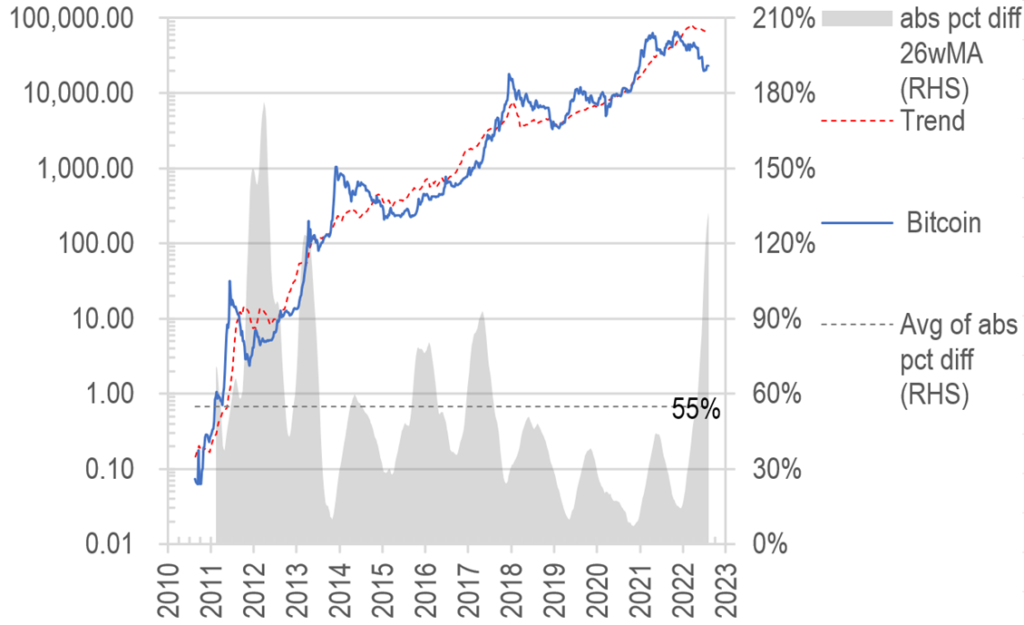
But sadly the variances of trend compared to actual prices were still some way off, until we increased the weighting of the M3 element (after all, money printing drives all fiat devaluation no?), to finally reach the more satisfying outcome shown here:
Chart 8: BTC price as predicted by our “grand unified theory” model
So now we have reduced the variance measured from the first version’s 66% to now 55% – still large by traditional asset standards – but we have some further refinement ideas already, and if we make enough progress, will share in a separate missive…
The advantages of the new methodology are multiple: a) it is not purely statistically driven; b) the model inputs are relevant and quantifiable; c) input variables allow for significantly more real world twists and turns in the fitted line which the statistical method is incapable of producing. Perhaps at some stage, this new grand unified theory will be useful as an input in our investment models…
We are definitely not finished in this quest for perfect modelling of Bitcoin prices, and there is a lot more work to be done, we leave you with a mystery chart that seems to do away with the problem of decaying exponential growth:
Chart 9: another elegant way to present linear BTC price trend