As interest rates spike and cost of living crises bite across the world, it is even more important now to choose one’s investment (or living) destinations carefully. On top of the usual comparisons of tax rates between jurisdictions (see earlier article “Lower US State Tax Drives Population Inflows, Home Price Rises”), this article employs a slightly different angle – the composition of tax takes between host governments. We undertake this exercise using Tax Foundations’ data which breaks down state tax income by four main components: corporate income tax, individual income tax, sales tax, and property tax.
Preferring low income tax and fair individual-corporate balance
For most income earning job holders who may also be home owners, it may be reasonable to assume that they prefer paying lower income tax. On top of that we would also assume that when individuals are paying similar (or lower) levels of tax compared to companies, the smaller guy (individual) would be getting more fairly treated or allowed more individual liberty.
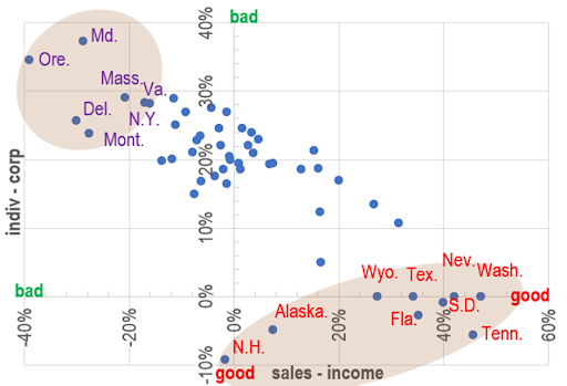
One way to quantify these preferences is to plot these preferences on a scattergram using two measurements:
- Higher sales tax take vs income tax – meaning more of the government’s income comes from consumption rather than savings, thus encouraging investment for longer term if not implying low absolute income tax rates, this is captured below on the X-axis;
- Lower individuals tax than corporates – put another way, this state of affairs results either when there is a booming corporate sector (leading to higher corporate income taxes) or when the resident individuals get to keep more of their salaries/profits instead of just the big corporates being able to do that (as they have the clout/resources to negotiate/threaten govts into large tax concessions) – this metric is captured on the Y-axis:
Chart 1: higher sales & corporate tax takes vs individual taxes are ‘good’, and vice versa |
The spread of the scatter is surprisingly linear, and we have highlighted the ‘desirable’ end of the spectrum in red – states that fall into this category include: Texas, Wyoming, Nevada, Washington, South Dakota, Tennessee, Florida, Alaska and New Hampshire.
On the other extreme (the high individual tax states) we have these ‘bad’ states in purple: Oregon, Maryland, Massachusetts, and Delaware, Virginia, and New York.
States with low income tax AND low property tax
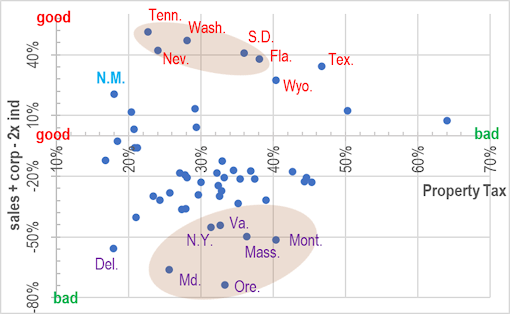
For property investors, lower property tax burden is also an important consideration, so this is what we did next – bombining the two metrics from last section into one (now represented by % sales tax + % corporate tax – % individual tax x 2), and then comparing the result to the proportion of state tax income from property. The results are shown in the chart below:
Chart 2: winners from last section which are also low property tax states – represented by red text in orange shade |
The results are interesting – the number of states that meet both low income tax and low property tax criteria now falls, with Tennessee, Nevada, Washington, South Dakota, now the remaining front runners and Florida just scraping in. A new entry however has popped up in the form of New Mexico (represented as N.M. above), which has one of the lowest property taxes (plus great weather) so may well be a good choice too for investors who are not earning a big income? On the opposite end of the spectrum (unfavourable individual tax states), Delaware has lower property tax burdens also, but probably not ideal for the average middle class property owner given its reputation of being a corporate tax haven… the other regulars which score badly on both fronts are Oregon, MA, and Montana.
Internal migration proves thesis right
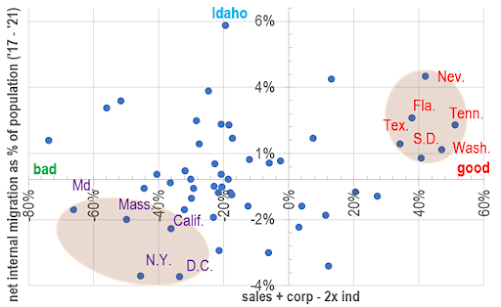
To prove our hypothesis that the above identified low tax states are indeed attractive, we take a look at how domestic migration played out in recent years. As a percent of state populations in 2017, we look at the proportional net internal migration numbers and use this statistic as a proxy for how people either flock to, or flee from individual states. Here are the results
Chart 3: Low tax states attract population inflows |
Perhaps not surprisingly, our ‘attractive’ states (in red text) invariably saw net domestic migration versus the high tax states (purple text) seeing outflows. So our top 3 states (from Chart 2) are also states here with the highest population inflows (Nevada, Florida, Tennessee), whereas the bottom states also saw meaningful outflows (Maryland, New York, and MA).
Housing price to income ratio
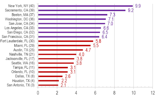
To add icing on the cake, cities from some of our top states also appear on the cheapest housing market list – according to the 2022 Numbeo home price to income ratio rankings, the good affordability cities (ie with low multiples and high rankings) seem to feature our top states from the foregoing analysis, while the reverse seems to be the case for the expensive cities. In the chart below, the number in brackets after the city is the ranking number out of 40, and the colouring follows the same scheme we have used in the earlier charts:
Chart 4: Home price to income ratio – affordable tax states also have affordable homes? |
This may sound too good to be true, but if the trend of continuous inflows persist, perhaps the cheap home price states will not stay cheap for long…
The author would like to thank Jasper Tan Cheuk Him from The University of Hong Kong majoring in Economics and Finance for assisting in data collection, analysis, and drafting of this article.


